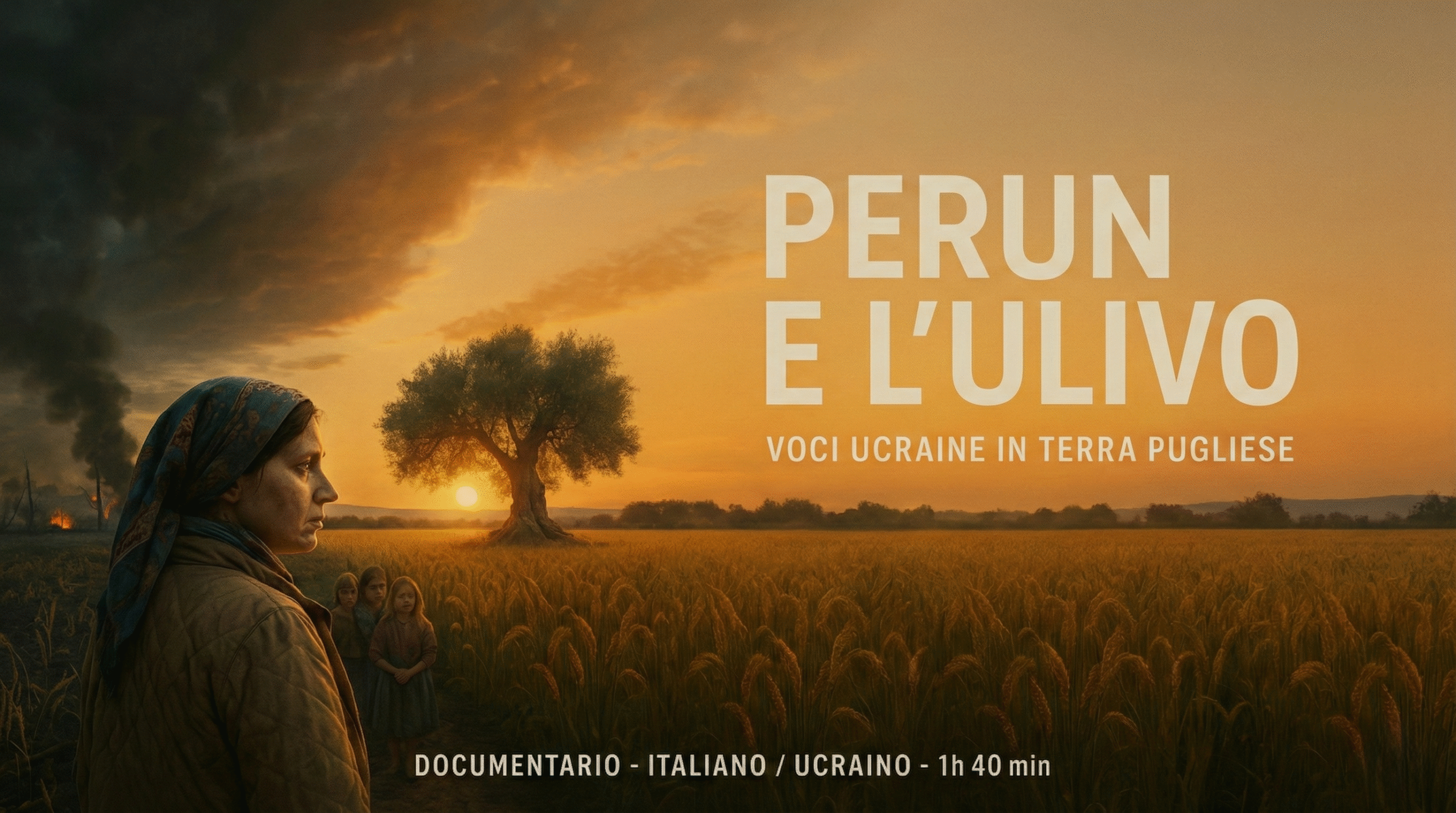
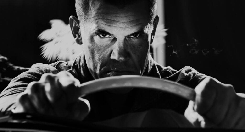
Color is like the secret sauce of filmmaking. It’s not just about making things look pretty—it’s about making your audience feel something. Whether it’s the warm glow of a nostalgic moment or the cold, stark blues of a dystopian world, color shapes the story in ways words and music alone can’t. As a filmmaker, two key skills will help you wield this power: color correction and color harmonies. Let’s break them down and explore how they can elevate your films.
Color Correction: Getting Your Footage Ready for the Magic
Before you can play with colors to create mood, you need a clean slate. That’s where color correction comes in. Think of it as tidying up your footage so it looks natural and consistent, like making sure all the puzzle pieces fit before you start painting. What Color Correction Involves:
- Fixes Exposure: Adjusts shadows, midtones, and highlights so your image isn’t too dark, too bright, or washed out.
- Nails White Balance: Makes sure whites look white (not blue or yellow) and skin tones feel real, no matter what lighting you shot in.
- Matches Shots: Ensures footage from different cameras or times of day looks seamless in the same scene.
- Zaps Color Casts: Gets rid of weird tints—like that greenish glow from fluorescent lights or a blue hue from LEDs.
- Color correction isn’t glamorous, but it’s essential. It’s like prepping a canvas before painting a masterpiece. Without it, your creative choices later won’t land as well.
Think of color correction as technical housekeeping—it gets your footage clean and neutral, providing a solid base for the next stage: creative grading.
Popular Color Harmonies to Try
Here are some go-to color schemes filmmakers use, along with why they work:
Popular Color Harmonies in Film:
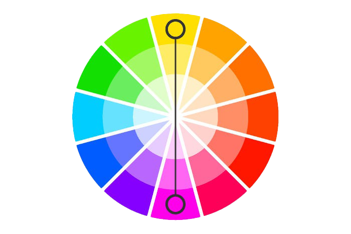
- Complementary Colors (High Contrast Emotion)
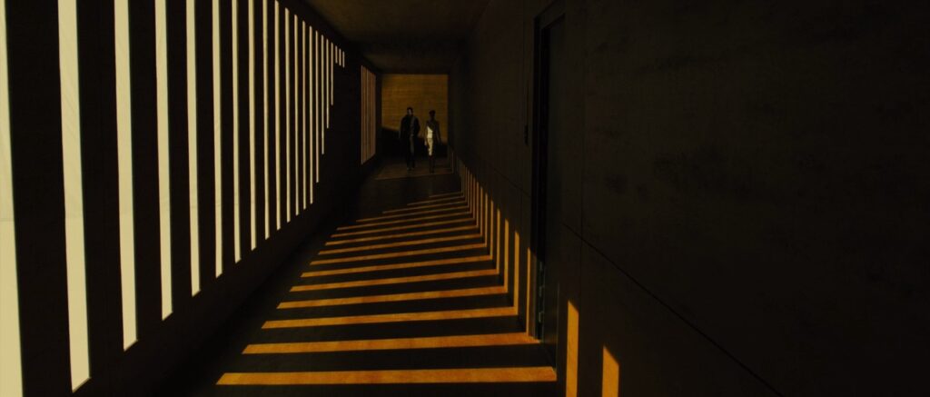
Think blue and orange—a dynamic duo you’ve seen in blockbusters like Mad Max: Fury Road. These opposites on the color wheel create bold contrast, perfect for action or intense moments.

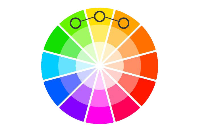
- Analogous Colors (Cohesion and Mood)
These are colors next to each other, like blue, blue-green, and green. They feel cohesive and calm, as seen in the dreamy palettes of Moonlight or Her. Great for emotional or intimate scenes.


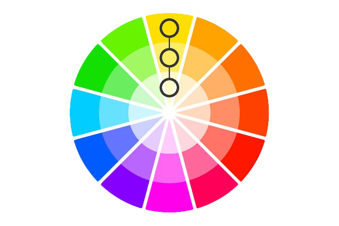
- Monochromatic Colors (Minimalism and Focus)
Stick to one hue (like shades of green) with different brightness levels. This creates a unified, immersive world—think The Matrix’s iconic green tint or Sin City’s stark black-and-white with red pops.

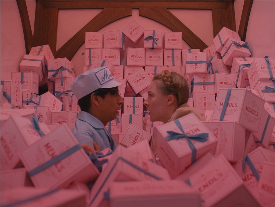
- Triadic Colors (Bold and Balanced)
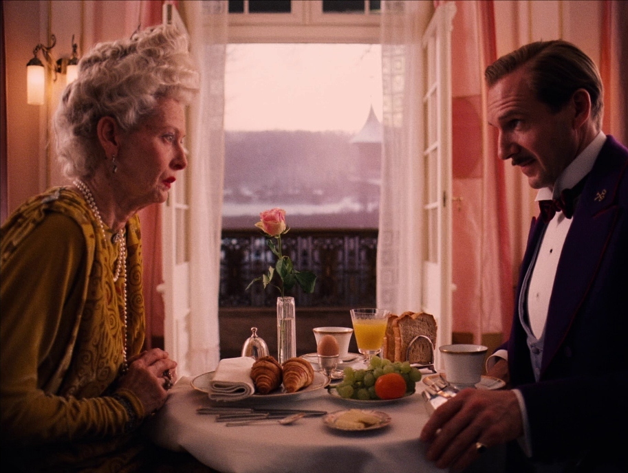
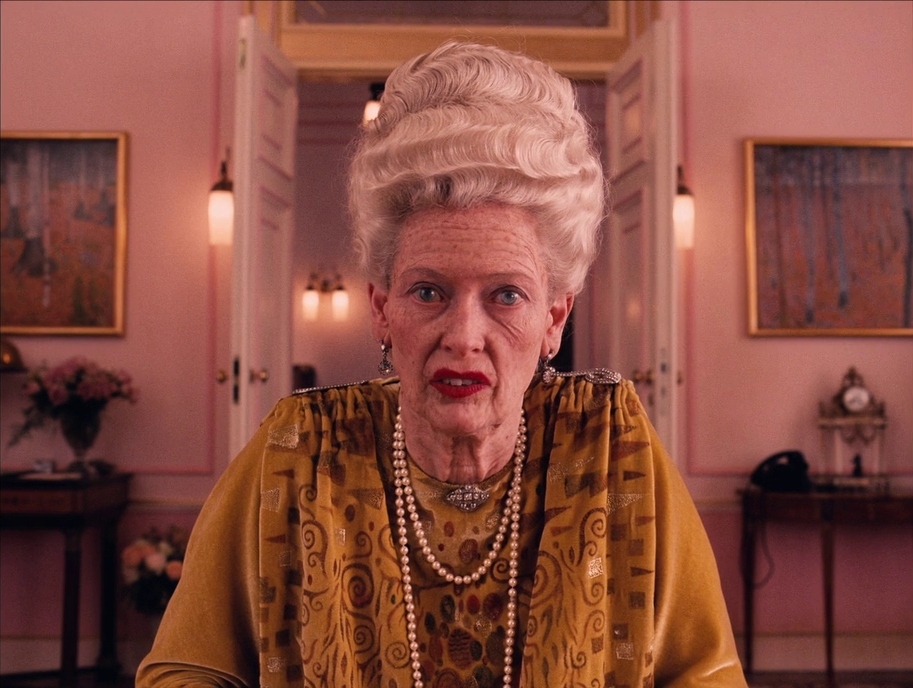
Three evenly spaced colors (like red, blue, yellow) create a bold, lively look. It’s tricky but rewarding, as seen in some of Wes Anderson’s colorful films.
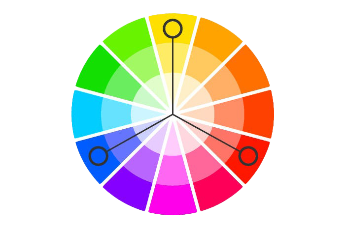
- Split-Complementary (Dynamic But Subtle)
A middle ground between complementary and analogous, this scheme uses one color plus the two colors next to its opposite. It’s dynamic but less in-your-face, offering a nice balance.

Why Color Matters: Telling Stories Without Words
Color isn’t just eye candy—it’s a storytelling tool. Here’s how it can transform your film:
Show Character Emotions: Cool blues might hint at a character’s loneliness, while warm oranges can feel like home or hope.
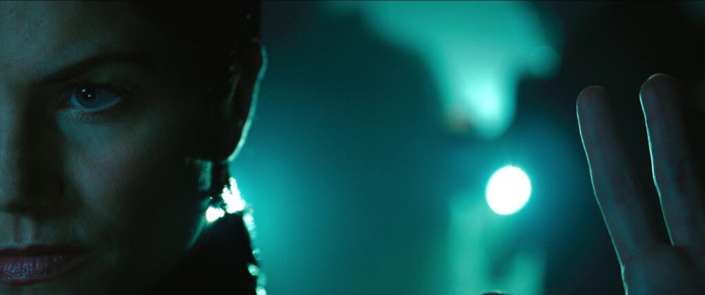
Set the Scene: A futuristic city might glow with teal and purple, while a sepia-toned flashback screams “the past.”
Guide the Audience’s Feelings: Red can signal danger or passion, green might evoke envy or decay—it all depends on how you use it.
The best part? You don’t need a huge budget to make color work for you. It’s about intention and creativity.

Tools to Bring Your Vision to Life
Here are some popular tools filmmakers use for color correction and grading:
DaVinci Resolve: The gold standard for color work, with powerful tools like waveforms and vectorscopes.

Baselight: Baselight is a high-end colorgrading system developed by FilmLight, widely used in professional filmmaking for color correction and grading. It’s a favorite among colorists for its powerful tools, intuitive interface, and real-time performance, enabling precise control over color balance, exposure, and creative looks.
These programs let you tweak colors with precision, use LUTs (pre-made color “filters”), and analyze your footage to make sure it’s technically spot-on.
Inspiration from the Pros
Want to see color in action? Check out these films for inspiration:
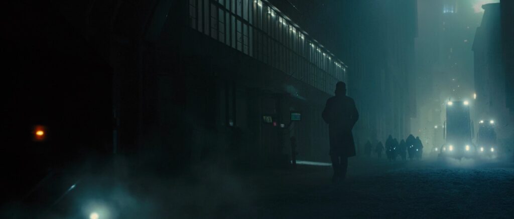
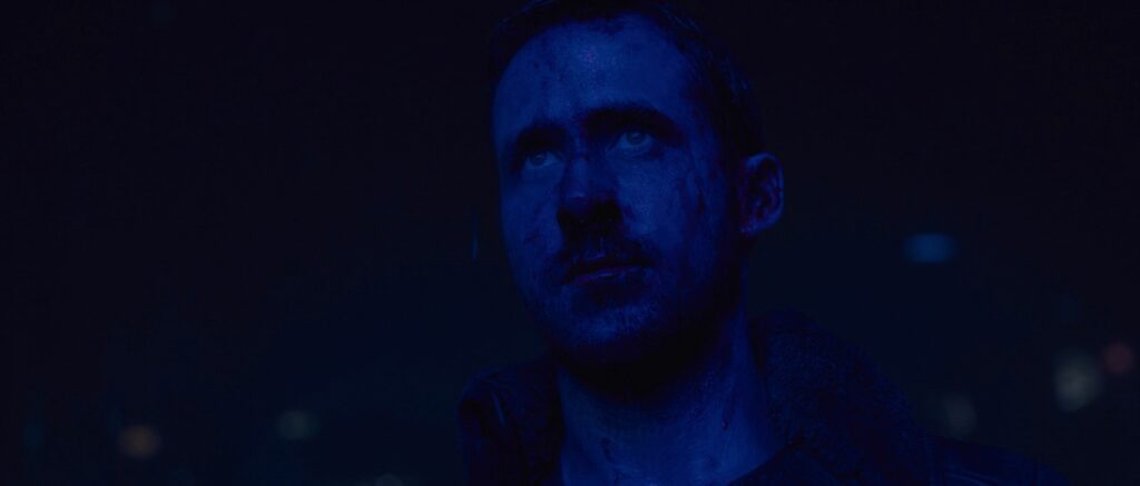
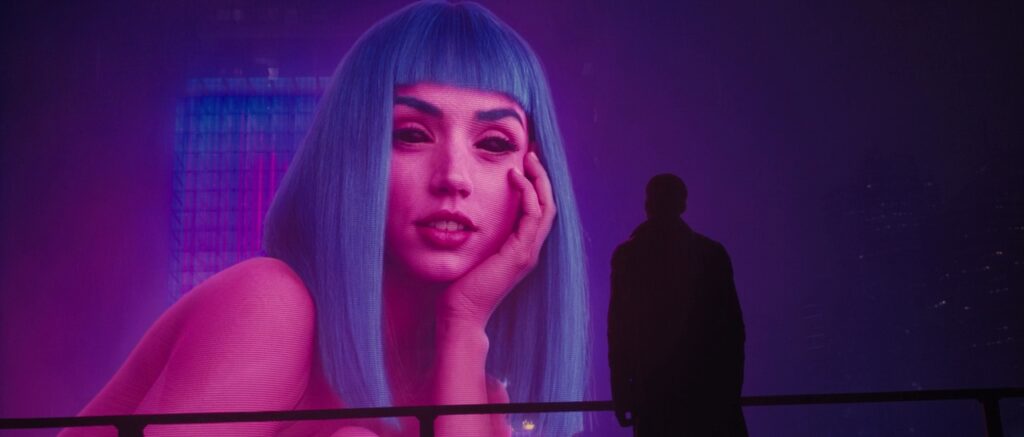
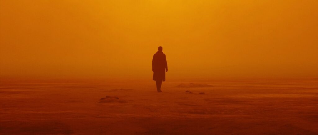
Blade Runner 2049: Its blue-orange palette pits stark isolation against gritty, industrial warmth.


The Grand Budapest Hotel: Wes Anderson’s triadic pinks, purples, and yellows create a whimsical, storybook feel.

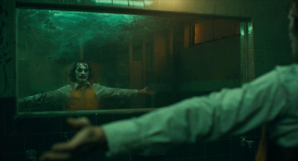
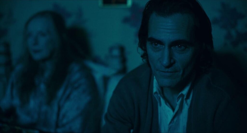
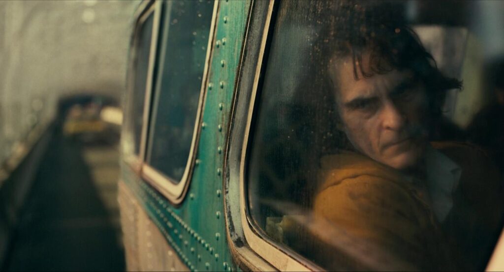
Joker: A grimy green and mustard palette mirrors the character’s unraveling mind and a decaying Gotham.


Each of these films uses color deliberately to make you feel the story, not just watch it.
Your Turn: Make Color Your Storyteller
Color is more than decoration—it’s emotion, atmosphere, and narrative rolled into one. Start with color correction to ensure your footage is clean and consistent. Then, use color harmonies to craft a visual language that pulls your audience into the story.
So, grab your camera, fire up your editing software, and start experimenting. What mood do you want to evoke? What story do you want to tell? With color, the possibilities are endless—and the power is in your hands.
If you have a problem with colour correction . you can always contact us !